Have You Seen This New Feature in Medium's App?
It made me wonder…why would I want to use it as a reader? But it also answered my question about why the views dropped so dramatically last month…
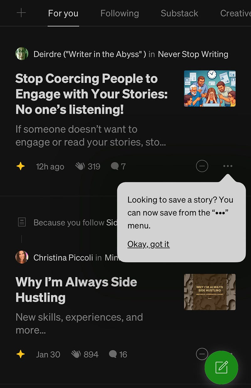
Yesterday I was browsing through Medium on my mobile when I stumbled upon this:
The “save” button is moved behind the menu, and replaced with a “see less” button.
The problem is I follow both writers. It makes me wonder: Why would I want to see LESS from people I FOLLOW?
This is not the first time Medium has made such a move. A few months ago it introduced just a pop-up message asking me if I want to see less, again from people I follow and again on the “For you” tab.
As a digital marketer, I’m curious: what kind of UX design insight must be behind this change?
I mean, really!?
It made me wonder…why would I want to use it as a reader?
I bet lots of people who used to save articles for later reading now press the “see less” button. The result: drop in views!!
Now I know why so many writers reported a decrease last month.
And I can think of so many reasons why less earnings for writers is good for Medium. You can read my honest opinion here.


